As Excel is primarily used for recording numerical data, it is often necessary to insert charts for clarity of information. Inserting charts in Excel is an easy procedure. The options available for it are as follows
- Bar Chart
- Hierarchy Chart
- Waterfall or Stock Chart
- Line Chart
- Statistic Chart
- Combo Chart
- Pie and Doughnut Chart
- Scatter or Bubble Chart
- Surface or Radar Chart
Each one of these differ in the way the data is represented and thus, can be used according to one’s necessity.
Afreen has an Excel sheet with her, containing the salaries of her various employees, for which she is trying out different charts to choose the best one. How will she create these?
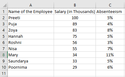
Bar Chart
She should select the data for which she wants to make a chart by dragging the fill handle and then clicking on the ‘Insert Bar Chart’ icon from the ‘Charts’ grouping. A dropdown list showing her the various available bar charts will be displayed. She can select the one that best suits her. A chart as follows will appear. The ‘Chart Tools’ tab will open my default on the ribbon from where she can format her chart as required.
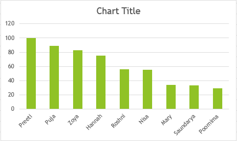
Hierarchy Chart
She can select the data for which she wants to make a chart by dragging the fill handle and then clicking on the ‘Insert Hierarchy Chart’ icon from the ‘Charts’ grouping. A dropdown list showing her the various available hierarchy charts will be displayed. She can select the one that best suits her. A chart as follows will be created. The ‘Chart Tools’ tab will open my default on the ribbon from where she can format her chart as required.
The first one is called a Treemap and the second one Sunburst. These are the two types of Hierarchy Charts available in Excel.
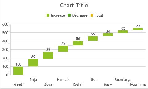
Waterfall or Stock Chart
She should select the data for which she wants to make a chart by dragging the fill handle and then clicking on the ‘Insert Waterfall/Stock Chart’ icon from the ‘Charts’ grouping. A dropdown list showing her the various available waterfall and stock charts will be displayed. She can select the one that best suits her. A chart as follows will appear. The ‘Chart Tools’ tab will open my default on the ribbon from where she can format her chart as required.
The following is a Waterfall Chart.
Afreen can not use a stocks chart for the kind of data she is dealing with. These are used when the ‘high price’, ‘low price’ and the ‘closing price’ of a stock is given.
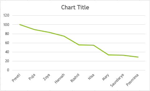
Line Chart
She should select the data for which she wants to make a chart by dragging the fill handle and then clicking on the ‘Insert Line Chart’ icon from the ‘Charts’ grouping. A dropdown list showing her the various available line charts will be displayed. She can select the one that best suits her. A chart as follows will appear. The ‘Chart Tools’ tab will open my default on the ribbon from where she can format her chart as required.
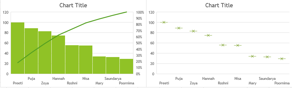
Statistic Chart
She should select the data for which she wants to make a chart by dragging the fill handle and then clicking on the ‘Insert Statistic Chart’ icon from the ‘Charts’ grouping. A dropdown list showing her the various available statistic charts will be displayed. She can select the one that best suits her. A chart as follows will appear. The ‘Chart Tools’ tab will open my default on the ribbon from where she can format her chart as required.
The first one is called a ‘Histogram’ and the second one is called ‘Box and Whisker’ type.
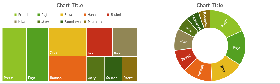
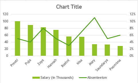
Combo Chart
She should select the data for which she wants to make a chart by dragging the fill handle and then clicking on the ‘Insert Combo Chart’ icon from the ‘Charts’ grouping. A dropdown list showing her the various available combo charts will be displayed. She can select the one that best suits her. A chart as follows will appear. The ‘Chart Tools’ tab will open my default on the ribbon from where she can format her chart as required.
A combo chart is used for data that has different kinds of information, and is not possible for the kind of data she is using to make charts here. However, if she wanted to record the salaries and absenteeism of the same employees, this is how the chart would look like.
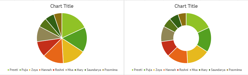
Pie and Doughnut Chart
She should select the data for which she wants to make a chart by dragging the fill handle and then clicking on the ‘Insert Pie/Doughnut Chart’ icon from the ‘Charts’ grouping. A dropdown list showing her the various available Pie and Doughnut charts will be displayed. She can select the one that best suits her. A chart as follows will appear. The ‘Chart Tools’ tab will open my default on the ribbon from where she can format her chart as required.
The first one is a pie chart and the second one is called a ‘Doughnut’.
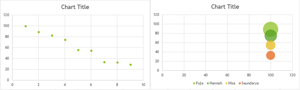
Scatter or Bubble Chart
She should select the data for which she wants to make a chart by dragging the fill handle and then clicking on the ‘Insert Bar Chart’ icon from the ‘Charts’ grouping. A dropdown list showing her the various available bar charts will be displayed. She can select the one that best suits her. A chart as follows will appear. The ‘Chart Tools’ tab will open my default on the ribbon from where she can format her chart as required.
The first one is a ‘Scatter’ chart and the second one is a ‘Bubble’ chart. In the latter, the chart is prepared for sets of three ranges, of the given data.
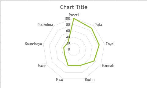
Surface or Radar Chart
She should select the data for which she wants to make a chart by dragging the fill handle and then clicking on the ‘Insert Bar Chart’ icon from the ‘Charts’ grouping. A dropdown list showing her the various available bar charts will be displayed. She can select the one that best suits her. A chart as follows will appear. The ‘Chart Tools’ tab will open my default on the ribbon from where she can format her chart as required.
The following is a Radar Chart.
 A surface chart is used to show the varying trends of a particular value with time and is not possible for the kind of data Afreen is using.