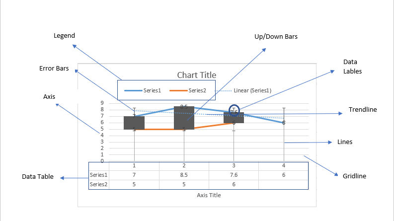
Sonia has made a chart in her Excel sheet for her school project but her teacher has asked her to insert some chart elements to make it more reader-friendly. In this module, we will look at how she can insert the various chart options.
How to Add Chart Elements:
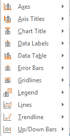
To add chart elements, Sonia should select the chart, and then go to the ‘Add Chart Elements’ option from the ‘Chart Layouts’ group of ‘Chart Tools’ – ‘Design’ tab. The following dropdown list will appear.
We will look at each of these options in detail:
Axes:
This option will insert more axes on the chart. ‘Primary Horizontal’ will insert horizontal axes and ‘Primary Vertical’ will insert vertical axes.
Axis Titles:
This option will insert axis titles on the chart. ‘Primary Horizontal’ will insert an axis title for the horizontal axis and ‘Primary Vertical’ will insert title for the vertical axis.
Chart Title:
This option will insert a chart title on the chart. ‘None’ will remove any chart tiles inserted, ‘Above Chart’ will insert the title above the graphic, and ‘Centred Overlay’ to insert a title that overlaps the chart and is present towards the middle.
Data Labels:
This option will insert the data plotted on the respective bar. They can be inserted ‘Center’, ‘Inside End’, ‘Inside Base’ ‘Outside End’ or as a ‘Data Callout’. A data callout will have a speech bubble coming out of the bar, depicting the data. ‘None’ will remove any labels that were already present.
Data Tables:
This option will insert a table below the chart showing the various data values of the chart. He can insert this with or without legend keys.
Error Bars:
These are used to represent how the data is variable and the uncertainty present within this. The various options available to do this are ‘Standard Error’, ‘Percentage’ and ‘Standard Deviation’.
Gridlines:
This option will insert more gridlines on the chart. ‘Primary Major Horizontal’ and ‘Primary Major Vertical’ will insert gridlines for major values like whole numbers while ‘Primary Minor Horizontal’ and ‘Primary Minor Vertical’ insert gridlines for values within these major numbers. ‘None’ will remove all gridlines.
Legend:
This option will show the reader what each bar of the graph stands for. The options available are ‘Top’, ‘Bottom’, ‘Right’ and ‘Left’. ‘None’ will remove all legends.
Lines:
This option will draw lines on the axes corresponding to values on the chart. The two options available are ‘Drop lines’ to drop lines on the horizontal axis and ‘High- Low lines’ that join the values of y -axis for multiple graph lines at the same point on the x-axis. ‘None’ will remove all.
Trendline:
A trendline will show the overall trend of the chart. ‘Linear’ will insert a straight line joining the values, ‘Exponential’ will insert a curved one, ‘Linear Forecast’ will extend the line to forecast values for the future with the given data and ‘Moving Average’ calculates the average value of the trends and forecasts it for the future. ‘None’ will remove all trendlines.
Up/Down Bars:
This option will draw bars on the axes corresponding to values on the chart. It will join the values of y -axis for multiple graph lines at the same point on the x-axis using bars. ‘None’ will remove all.

